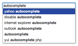 The AutoComplete widget provides a flexible, configurable, and accessible implementation of the AutoComplete design pattern, which offers suggestions or provides some other form of filtering or completion as a user types text in an input field.
In addition to the core logic for filtering and completion, AutoComplete also provides options for custom filtering, highlighting, and formatting of results; delimited queries; result retrieval from a variety of local and remote sources including YQL, JSONP, and XHR; and more.
AutoComplete is also built to be modular and easy to extend so that it can be used as the basis for custom implementations and widgets.
Getting Started
To include the source files for AutoComplete and its dependencies, first load the YUI seed file if you haven't already loaded it.
<script src="http://yui.yahooapis.com/3.11.0/build/yui/yui-min.js"></script>
Next, create a new YUI instance for your application and populate it with the
modules you need by specifying them as arguments to the YUI().use() method.
YUI will automatically load any dependencies required by the modules you
specify.
<script>
// Create a new YUI instance and populate it with the required modules.
YUI().use('autocomplete', function (Y) {
    // AutoComplete is available and ready for use. Add implementation
    // code here.
});
</script>
For more information on creating YUI instances and on the
use() method, see the
documentation for the YUI Global Object.
Using AutoComplete
Quick Start
In a hurry? Here's how to get up and running with AutoComplete in just a few lines of code. The following examples demonstrate how to use AutoComplete with several common result sources. Pick the one that most closely matches your needs (you only need one!).
YUI().use('autocomplete', 'autocomplete-highlighters', function (Y) {

  // Add the yui3-skin-sam class to the body so the default
  // AutoComplete widget skin will be applied.
  Y.one('body').addClass('yui3-skin-sam');

  // The following examples demonstrate some of the different
  // result sources AutoComplete supports. You only need to
  // pick one, you don't need them all. Assume the '#ac-input'
  // element id used in this example refers to an <input>
  // element on the page.

  // Array source. Replace the example array with any array.
  Y.one('#ac-input').plug(Y.Plugin.AutoComplete, {
    resultHighlighter: 'phraseMatch',
    source: ['foo', 'bar', 'baz']
  });

  // YQL source. Leave the {query} placeholder as is; AutoComplete
  // will replace it automatically.
  Y.one('#ac-input').plug(Y.Plugin.AutoComplete, {
    resultHighlighter: 'phraseMatch',
    source: 'select * from search.suggest where query="{query}"'
  });

  // JSONP URL source. Leave the {query} and {callback} placeholders
  // as is; AutoComplete will replace them automatically.
  Y.one('#ac-input').plug(Y.Plugin.AutoComplete, {
    resultHighlighter: 'phraseMatch',
    source: 'http://example.com/search.jsonp?q={query}&callback={callback}'
  });

  // XHR URL source (no callback). Leave the {query} placeholder
  // as is; AutoComplete will replace it automatically.
  Y.one('#ac-input').plug(Y.Plugin.AutoComplete, {
    resultHighlighter: 'phraseMatch',
    source: 'http://example.com/search.json?q={query}'
  });

});
In most cases, one of these examples should be enough to get you started. For a more complete discussion of how to use, configure, and customize AutoComplete, read on.
Instantiating AutoComplete
There are two ways to instantiate an AutoComplete widget: you can plug Y.Plugin.AutoComplete into an existing Y.Node instance, or you can create a new standalone instance of the Y.AutoComplete class.
Both instantiation methods provide the same AutoComplete functionality, so feel free to use whichever one you prefer. Throughout this guide and in the examples, the plugin method is used most, but the class method will work equally well in all cases.
Note: be sure to add the yui3-skin-sam classname to the
page's <body> element or to a parent element of the widget in order to apply
the default CSS skin. See Understanding Skinning.
<body class="yui3-skin-sam"> <!-- You need this skin class -->
See the Skinning section below for more info.
As a Plugin
To instantiate AutoComplete as a plugin, use the plug() method to attach it to an existing Y.Node instance. The node must be an <input> or <textarea> element. You may also provide a configuration object containing AutoComplete config attributes, but this isn't required.
Y.one('#ac-input').plug(Y.Plugin.AutoComplete);
In most cases, you'll at least want to specify a source attribute, which tells AutoComplete where to get results. The simplest type of source is an array of strings.
Y.one('#ac-input').plug(Y.Plugin.AutoComplete, {
  source: ['friends', 'Romans', 'countrymen']
});
Once you've plugged AutoComplete into a node, you can access the AutoComplete instance through the node's ac property.
var inputNode = Y.one('#ac-input');

inputNode.plug(Y.Plugin.AutoComplete);
inputNode.ac.set('source', ['friends', 'Romans', 'countrymen']);
When using AutoComplete as a plugin, the AutoComplete widget markup will be rendered automatically as soon as it's plugged into a node instance. If you'd like to defer rendering until a time of your choosing, set the render config attribute to false.
// Don't render immediately.
Y.one('#ac-input').plug(Y.Plugin.AutoComplete, {render: false});

// Render only when I say so.
Y.one('#ac-input').ac.render();
By default, the AutoComplete widget markup is appended to the parent node of the node it's plugged into. If you would rather render the markup inside a different parent, pass a CSS selector or Y.Node instance to the render config attribute or the render() method.
// Render inside the #ac-parent node.
Y.one('#ac-input').plug(Y.Plugin.AutoComplete, {render: '#ac-parent'});
For more on available configuration attributes, see the Configuring AutoComplete section below. For more on the different result sources AutoComplete supports, see Result Sources.
As a Class
To instantiate AutoComplete as a class, create a new instance of Y.AutoComplete and specify an inputNode config value. The inputNode must be a CSS selector, Y.Node instance, or DOM element referencing an <input> or <textarea> element that already exists on the page.
var ac = new Y.AutoComplete({inputNode: '#ac-input'});
inputNode is the only required configuration attribute, but in most cases you'll also want to specify a source attribute, which tells AutoComplete where to get results. The simplest type of source is an array of strings.
var ac = new Y.AutoComplete({
  inputNode: '#ac-input',
  source   : ['friends', 'Romans', 'countrymen']
});
When instantiated as a class, the AutoComplete widget markup is not rendered automatically. To render it, either set the render config attribute to true at instantiation time or call the AutoComplete instance's render() method later.
// Render immediately.
var ac = new Y.AutoComplete({
  inputNode: '#ac-input',
  render   : true
});

// Don't render immediately.
var ac = new Y.AutoComplete({inputNode: '#ac-input'});

// Render only when I say so.
ac.render();
By default, the AutoComplete widget markup is appended to the parent node of the inputNode when the widget is rendered. If you would rather render the markup inside a different parent, pass a CSS selector or Y.Node instance to the render config attribute or the render() method.
// Render inside the #ac-parent node.
var ac = new Y.AutoComplete({inputNode: '#ac-input'});
ac.render('#ac-parent');
For more on available configuration attributes, see the Configuring AutoComplete section below. For more on the different result sources AutoComplete supports, see Result sources.
DOM Structure
When the AutoComplete widget is rendered, it will add the CSS class yui3-aclist-input to the specified inputNode, along with several ARIA attributes.
<!-- Before AutoComplete is rendered -->
<input id="ac-input" type="text">

<!-- After AutoComplete is rendered -->
<input id="ac-input" type="text" class="yui3-aclist-input"
    aria-autocomplete="list" aria-expanded="false"
    aria-owns="yui_3_3_0_1_129140941365181" autocomplete="off">
AutoComplete will also add markup for the list widget. By default, the list markup will be appended to the parent node that contains the inputNode.
<!-- AutoCompleteList widget markup with sample results -->
<div id="yui_3_3_0_1_129140941365147"
    class="yui3-widget yui3-aclist yui3-widget-positioned yui3-aclist-hidden"
    style="position: absolute; width: 254px; left: 13px; top: 32px;"
    aria-hidden="true">

  <div id="yui_3_3_0_1_129140941365150" class="yui3-aclist-content">
    <ul class="yui3-aclist-list" id="yui_3_3_0_1_129140941365181" role="listbox">
      <li class="yui3-aclist-item" id="yui_3_3_0_1_1291409413651452" role="option">friends</li>
      <li class="yui3-aclist-item" id="yui_3_3_0_1_1291409413651454" role="option">Romans</li>
      <li class="yui3-aclist-item" id="yui_3_3_0_1_1291409413651456" role="option">countrymen</li>
    </ul>
  </div>

</div>
For information on skinning the AutoComplete widget, see the Skinning section below.
Configuring AutoComplete
Except for inputNode, all configuration attributes are optional. These lists only contain the most interesting attributes. For a complete list of all attributes, please refer to the API docs.
Base Config Attributes
These attributes are provided by AutoCompleteBase, which is the core foundation for the AutoComplete widget. They are available on all AutoComplete instances.
| Attribute | Default | Description |
|---|---|---|
allowBrowserAutocomplete |
false |
Whether or not to enable the browser's built-in autocomplete functionality for input fields. |
enableCache |
true |
Whether or not to enable in-memory caching in result sources that support it. This can significantly improve performance for result sources that make remote requests (like JSONP, YQL, and XHR), so it's best to leave this enabled unless you have a good reason to disable it. |
inputNode |
none |
Required. <input> or <textarea> node to monitor for changes.
|
maxResults |
0 |
Maximum number of results to display. A value of 0 or less will allow an unlimited number of results.
|
minQueryLength |
1 |
Minimum number of characters that must be entered before a query event will be fired. A value of 0 allows empty queries; a negative value will effectively disable all query events and turn AutoComplete off.
|
queryDelay |
100 |
Number of milliseconds to wait after user input before triggering a This is useful to throttle queries to a remote data source, and to avoid distracting the user by showing them less relevant results before their typing pauses. |
queryDelimiter |
null |
Query delimiter string. When a delimiter is configured, the input value will be split on the delimiter, and only the last portion will be used in autocomplete queries and updated when the query attribute is modified. See Using Query Delimiters below for details.
|
requestTemplate |
null |
Source request template. This can be a function that accepts a query as a parameter and returns a string, or it can be a string containing the placeholder "{query}", which will be replaced with the URI-encoded query. The resulting string will be appended to the request URL when the
When the |
resultFilters |
[] |
Result filter name, function, or array of filter names and/or functions. See Filtering Results for details. |
resultFormatter |
null |
Function that should be used to format results. See Writing Result Formatters for details. |
resultHighlighter |
null |
Result highlighter name or function. See Highlighting Results for details. |
resultListLocator |
null |
Locator string or function that should be used to extract an array of results from a non-array response. See Locating Results for details. |
resultTextLocator |
null |
Locator string or function that should be used to extract a plain text string from a non-string result item. See Locating Results for details. |
source |
null |
Source for autocomplete results. The following source types are supported: Array, DataSource, Function, Object, JSONP URL (string), XHR URL (string), YQL query (string). For details on each source type, see Result Sources. |
List Config Attributes
These attributes are provided by AutoCompleteList, which is the implementation for the AutoComplete list widget. They are available on all instances of AutoComplete or AutoCompleteList, as well as on instances of the AutoComplete plugin.
| Attribute | Default | Description |
|---|---|---|
activateFirstItem |
false |
If true, the first item in the result list will be activated by default when the list is initially displayed and when results change.
|
align |
|
Widget alignment config. The node property is the element with which the result list should be aligned, and the points property specifies (by default) that the top left of the list should be aligned with the bottom left of the inputNode.
|
alwaysShowList |
false |
If true, the list will remain visible even when there are no results to display and the inputNode is not focused.
|
circular |
true |
If true, keyboard navigation will wrap around to the opposite end of the list when navigating past the first or last item.
|
scrollIntoView |
false |
If true, the viewport will be scrolled when necessary to ensure that the active list item is visible.
|
tabSelect |
true |
If true, pressing the tab key while the list is visible will select the active item, if any.
|
Aligning the List
By default, the autocomplete dropdown list will be automatically aligned with the bottom left corner of the input node it's attached to, and its width will be set to match the input node's. You can change the alignment of the list by specifying a custom value for the align attribute.
For example, to align the top left of the list with the top left of a particular node on the page (such as its container):
Y.one('#ac-input').plug(Y.Plugin.AutoComplete, {
  align: {
      node  : '#container',
      points: ['tl', 'tl']
  }
});
See the WidgetPositionAlign API docs for more details on alignment configs.
Using Query Delimiters
Using the queryDelimiter attribute, you can specify a delimiter string that should be used to split the value of the input field.
When a delimiter is set, the query attribute will only reflect the last delimited item in the input value, and only this item will be used for completion (the full input value will still be available from the value attribute).
For example, if queryDelimiter is set to ',' and the input node's value is 'foo, bar, baz', then the value of the query attribute will be 'baz'.
var inputNode = Y.one('#ac-input');

inputNode.set('value', 'foo, bar, baz');

inputNode.plug(Y.Plugin.AutoComplete, {
  queryDelimiter: ','
});

Y.log(inputNode.ac.get('query')); // => 'baz'
Y.log(inputNode.get('value'));    // => 'foo, bar, baz'
When the user selects an item from the result list, the selected item will replace only the last delimited item in the input value rather than replacing the entire value, and another delimiter string will be automatically appended to the value so that the user can continue typing and getting suggestions.
AutoComplete Events
These lists only contain the most interesting events. For a complete list, please refer to the API docs.
Base Events
These events are provided by AutoCompleteBase, which is the core foundation for the AutoComplete widget. They are available on all AutoComplete instances.
| Event | When | Payload |
|---|---|---|
clear |
The query has been completely cleared or no longer meets the minimum query length requirement. |
|
query |
The value of the input field has changed and the new value meets the criteria necessary to generate an autocomplete query. Can be prevented to stop the query from being sent. |
|
results |
Results are received from the result source. If no source has been set, this event will not fire. |
|
List Events
These events are provided by AutoCompleteList, which is the implementation for the AutoComplete list widget. They are available on all instances of AutoComplete or AutoCompleteList, as well as on instances of the AutoComplete plugin.
| Event | When | Payload |
|---|---|---|
activeItemChange |
The active list item (the item currently pre-selected via the keyboard) changes. When the user presses enter, this is the item that will become selected. |
|
hoveredItemChange |
The hovered list item (the item currently being hovered over by the mouse) changes. |
|
select |
A result is selected from the autocomplete list, typically via a keyboard action or a mouse click. |
|
visibleChange |
The visibility of the result list changes. |
|
Result Sources
Array/Object
Set the source attribute to an Array to use that array as the set of results for all queries. Combine this with one or more result filters to filter out results that aren't relevant for the current query.
Y.one('#ac-input').plug(Y.Plugin.AutoComplete, {
  source: ['foo', 'bar', 'baz']
});
You can also set source to an Object. When the query matches one of the properties on the object, the value of that property will be used as the results for the query.
Y.one('#ac-input').plug(Y.Plugin.AutoComplete, {
  source: {
    a: ['apple', 'airplane', 'awesome'],
    b: ['banana', 'boat', 'boring'],
    c: ['cherry', 'car', 'cacophonous']
  }
});
DataSource
Any YUI DataSource instance may be used as a result source. This is useful if you want to share data between multiple components on a page, or if you need to parse data or apply a DataSchema in a way that isn't feasible with other AutoComplete sources.
var ds = new Y.DataSource.IO({
  source: 'http://example.com/search'
});

Y.one('#ac-input').plug(Y.Plugin.AutoComplete, {
  requestTemplate: '?q={query}',
  source: ds
});
In this example, the requestTemplate attribute is set to a string containing a {query} placeholder. On each query, the placeholder will be replaced with the URI-encoded query value, and the resulting request string will be appended to the DataSource's source URL, resulting in a final URL like http://example.com/search?q=foo.
Function
Set the source attribute to a function to use that function as the result source. On each query, the function will be called with two arguments: the current query, and a callback function.
If the function is synchronous, meaning that results are available immediately, then it should return an array of results:
Y.one('#ac-input').plug(Y.Plugin.AutoComplete, {
  // Synchronous source function.
  source: function (query) {
    // ...arbitrary logic here...

    return ['foo', 'bar', 'baz'];
  }
});
If the function is asynchronous, meaning that it must make a network call or perform some other non-blocking activity from which it can't return results immediately, then an array of results should be passed to the provided callback function when the results become available, and the function should not return a value:
Y.one('#ac-input').plug(Y.Plugin.AutoComplete, {
  // Asynchronous source function.
  source: function (query, callback) {
    // Wait a little while without blocking execution, then provide results.
    // This simulates a non-blocking operation such as a JSONP or XHR request.
    setTimeout(function () {
      callback(['foo', 'bar', 'baz']);
    }, 100);

    // Note that the source function doesn't return a value.
  }
});
JSONP/XHR URL
Set the source attribute to a URL string to use that URL as the result source.
The URL string must include a {query} placeholder. On each query, AutoComplete will replace this with the current query and will make a request to the URL.
If the URL string includes a {callback} placeholder, it will be called using JSONP, and the {callback} placeholder will be replaced with the name of a dynamically generated JSONP callback function that AutoComplete will create. The server is expected to respond with a JavaScript value wrapped in a call to this callback function.
If the URL string does not include a {callback} placeholder, it will be called using XHR (XMLHttpRequest). XHR URLs must abide by the same origin policy or the browser will refuse to send the request. The server is expected to respond with valid JSON data, which AutoComplete will attempt to parse.
// JSONP URL source.
Y.one('#ac-input').plug(Y.Plugin.AutoComplete, {
  source: 'http://example.com/search.jsonp?q={query}&callback={callback}'
});

// XHR URL source (no callback).
Y.one('#ac-input').plug(Y.Plugin.AutoComplete, {
  source: 'http://example.com/search.json?q={query}'
});
You may also optionally include a {maxResults} placeholder in the URL, which will be replaced with the value of the maxResults attribute (or 1000 if the maxResults attribute is less than or equal to 0).
Responses from JSONP and XHR URL sources are automatically cached based on the query value for the duration of the pageview on a per-instance basis (in other words, every AutoComplete instance has its own separate cache).
<select> Node
Set the source attribute to a <select> node to use its list of items as results. You'll also need to set the resultTextLocator attribute to 'text' or 'value' depending on what you want to use as the text of each result.
Y.one('#ac-input').plug(Y.Plugin.AutoComplete, {
    resultTextLocator: 'text',
    source: Y.one('#my-list')
});
Each result from a <select> source will be an object with the following properties:
html(String)-
HTML content of the
<option>element. index(Number)-
Index of the
<option>element in the list. node(Y.Node)-
Node instance referring to the original
<option>element. selected(Boolean)-
Whether or not this item is currently selected in the
<select>list. text(String)-
Text content of the
<option>element. value(String)-
Value of the
<option>element.
YQL Query
Set the source attribute to a YQL query string to use that YQL query as the result source.
The string may include a {query} placeholder. On each query, AutoComplete will replace this with the current query and will make a call to YQL to get results.
Y.one('#ac-input').plug(Y.Plugin.AutoComplete, {
  source: 'select * from search.suggest where query="{query}"'
});
You may use a {request} placeholder to insert the requestTemplate value rather than the raw query. This allows you to customize the query if desired (such as by double-escaping it, which is necessary for some YQL queries that embed URLs).
You may also optionally include a {maxResults} placeholder in the YQL query, which will be replaced with the value of the maxResults attribute (or 1000 if the maxResults attribute is less than or equal to 0).
AutoComplete does its best to automatically parse results out of YQL responses, but a wide variety of different YQL response formats are possible, so it may not always be possible for AutoComplete to guess the correct format. If you find that results aren't being parsed correctly, you may need to specify a custom resultListLocator and/or resultTextLocator as described in Locating Results.
Locating Results
Result List Locator
It's not uncommon for a result source to return results inside a larger data structure, such as an object that contains other metadata about the response alongside the results.
{
  "status": "ok",
  "query": "sample response",

  "data": {
    "results": [
      "foo",
      "bar",
      "baz"
    ],

    "resultCount": 3
  }
}
While AutoComplete automatically knows how to handle results that come back as a simple array, it needs some extra information in order to find a result array that's buried inside an object hierarchy. That's where the resultListLocator config attribute comes in.
Y.one('#ac-input').plug(Y.Plugin.AutoComplete, {
  resultListLocator: 'data.results',
  source: 'http://example.com/search.jsonp?q={query}&callback={callback}'
});
In the example above, the resultListLocator tells AutoComplete to look for a data property on the response object, followed by a results sub-property that contains an array of results. The hierarchy may be arbitrarily deep, as long as it's consistent across responses.
If the response format isn't always the same, you can specify a function as the resultListLocator and run your own arbitrary logic to find (or construct) the result array. The function will receive the raw response as an argument, and must return an array of results.
// Does the same thing as the previous example, but using a function.
Y.one('#ac-input').plug(Y.Plugin.AutoComplete, {
  resultListLocator: function (response) {
    return (response && response.data && response.data.results) || [];
  },

  source: 'http://example.com/search.jsonp?q={query}&callback={callback}'
});
Result Text Locator
Not all results are simple strings. Sometimes a result is an object containing lots of metadata, only part of which is a text string. In cases like this, AutoComplete needs to know how to find some text that it can display in the result list, use for highlighting, and insert into the input field when the user selects a result.
In the following sample, which is a subset of the data you might see in a response from the Twitter Search API, an array of tweet objects is returned.
{
  "query": "documentation",
  "results": [
    {
      "from_user": "yaypie",
      "from_user_id": 3840589,
      "from_user_id_str": "3840589",
      "created_at": "Mon, 06 Dec 2010 22:58:08 +0000",
      "id": 11917333878538241,
      "id_str": "11917333878538241",
      "text": "Is there such a thing as too much documentation?",
      "profile_image_url": "http://a3.twimg.com/profile_images/994441119/ryan-profile-big_normal.jpg"
    },

    ...
  ]
}
The resultTextLocator config attribute can be used to tell AutoComplete how to find some text within an individual result object, much like the resultListLocator attribute tells AutoComplete how to find an array of results within a response object.
Y.one('#ac-input').plug(Y.Plugin.AutoComplete, {
  resultListLocator: 'results',
  resultTextLocator: 'text',
  source: 'http://search.twitter.com/search.json?q={query}&callback={callback}'
});
This tells AutoComplete that the value of each result object's text property should be used whenever a plain text form of the result is needed.
The resultTextLocator can also be a function, which allows you to perform additional logic, such as combining multiple values into a single text string. The function will receive a single result object as an argument, and must return a text string. It will be called once for each result in the results array.
Y.one('#ac-input').plug(Y.Plugin.AutoComplete, {
  resultListLocator: 'results',

  resultTextLocator: function (result) {
    return result.from_user + ': ' + result.text;
  },

  source: 'http://search.twitter.com/search.json?q={query}&callback={callback}'
});
Filtering Results
After results are retrieved from a result source, it may be necessary to perform additional filtering to whittle down the result list to match the query, especially if the result source doesn't perform filtering itself. The resultFilters attribute can be used to specify a filter or array of filters for this purpose.
A result filter is simply a function that accepts the current query and an array of result objects as arguments, and returns a filtered array of result objects.
The autocomplete-filters module provides a prepackaged collection of result filters. This module isn't loaded by default in the autocomplete rollup, but can be loaded manually as needed.
// Include the autocomplete-filters module to use prepackaged filters.
YUI().use('autocomplete', 'autocomplete-filters', function (Y) {

  // Specify the name of the prepackaged filter you want to use, as
  // a string.
  Y.one('#ac-input').plug(Y.Plugin.AutoComplete, {
    resultFilters: 'phraseMatch'
  });

  // To use multiple filters, provide an array. Results will be passed
  // through each filter in the order they're listed in the array.
  Y.one('#ac-input').plug(Y.Plugin.AutoComplete, {
    resultFilters: ['charMatch', 'wordMatch']
  });

});
The following filters are available in the autocomplete-filters module:
| Filter | Description |
|---|---|
charMatch |
Returns results that contain all of the individual characters in the query, in any order (not necessarily consecutive). |
phraseMatch |
Returns results that contain the complete query as a phrase. |
startsWith |
Returns results that start with the complete query as a phrase. |
subWordMatch |
Returns results in which all the words of the query match either whole words or parts of words in the result. Non-word characters like whitespace and certain punctuation are ignored. |
wordMatch |
Returns results that contain all the individual words in the query, in any order (not necessarily consecutive). |
By default, all filters are case-insensitive. Case-sensitive versions are available, and can be used by appending Case to the filter name. For example, the case-sensitive version of the phraseMatch filter is phraseMatchCase.
In addition to the standard set of filters, the optional autocomplete-filters-accentfold module provides a set of filters that perform accent-folded matching.
Accent folding is when a character like é is converted to a non-accented form like e. This can be useful for performing loose matching (such as matching the word "résumé" when the query "resume" is typed), but also has some important caveats you should be aware of. See the Known Issues section below for details.
To use accent folding filters, include the autocomplete-filters-accentfold module, then specify a filter by appending Fold to the name. For example, the accent folding version of the phraseMatch filter is phraseMatchFold. Note that all accent folding filters are case-insensitive.
Highlighting Results
After results are retrieved and (optionally) filtered, you may want to highlight occurrences of the query within each result in order to indicate to the user why that result is relevant to what they typed. The resultHighlighter attribute can be used to specify a result highlighter for this purpose.
Like a result filter, a highlighter is simply a function that accepts the current query and an array of result objects as arguments. Whereas filters return a filtered array of result objects, highlighters return an array of HTML strings which will be used when results are displayed to the user.
The autocomplete-highlighters module provides a prepackaged collection of result highlighters. This module isn't loaded by default in the autocomplete rollup, but can be loaded manually as needed.
// Include the autocomplete-highlighters module to use prepackaged
// highlighters.
YUI().use('autocomplete', 'autocomplete-highlighters', function (Y) {

  // Specify the name of the prepackaged highlighter you want to
  // use, as a string. Unlike result filters, only one highlighter
  // may be used at a time.
  Y.one('#ac-input').plug(Y.Plugin.AutoComplete, {
    resultHighlighter: 'phraseMatch'
  });

});
The following highlighters are available in the autocomplete-highlighters module:
| Highlighter | Description |
|---|---|
charMatch |
Highlights individual query characters that occur anywhere in the result, in any order (not necessarily consecutive). |
phraseMatch |
Highlights the complete query as a phrase anywhere in the result. |
startsWith |
Highlights the complete query as a phrase at the start of the result. |
subWordMatch |
Highlights results in which all the words of the query match either whole words or parts of words in the result. Non-word characters like whitespace and certain punctuation are ignored. |
wordMatch |
Highlights individual words in the result that are also in the query, in any order (not necessarily consecutive). Non-word characters like punctuation are ignored. |
The prepackaged highlighters use a <b> element with the class yui3-highlight to highlight results. You can style the highlighting using CSS by referring to that class name.
By default, all highlighters are case-insensitive. Case-sensitive versions are available, and can be used by appending Case to the highlighter name. For example, the case-sensitive version of the phraseMatch highlighter is phraseMatchCase.
In addition to the standard set of highlighters, the optional autocomplete-highlighters-accentfold module provides a set of highlighters that perform accent-folded highlighting.
To use accent folding highlighters, include the autocomplete-highlighters-accentfold module, then specifiy a highlighter by appending Fold to the name. For example, the accent folding version of the phraseMatch highlighter is phraseMatchFold. Note that all accent folding highlighters are case-insensitive.
When using accent folding highlighters, there are some important caveats you should be aware of. See the Known Issues section below for details.
Customizing AutoComplete
Skinning
AutoComplete uses the following CSS classes to provide skinning hooks for its markup. See the DOM Structure for an example of the markup generated by the AutoComplete widget.
You can add your own CSS to override the styling of these classes and customize the display and layout of the AutoComplete widget.
| CSS Class | Description |
|---|---|
yui3-aclist |
The boundingBox node that contains the rest of the AutoComplete list widget markup.
|
yui3-aclist-aria |
ARIA live region container used to announce list updates to users of assistive tools. Positioned offscreen by default to make it invisible to sighted users. |
yui3-aclist-content |
The contentBox node that contains the AutoComplete list widget content. Apply visual styling like borders, padding, and margins to this node rather than the boundingBox.
|
yui3-aclist-hidden |
Class added to elements that should be hidden from both sighted and unsighted users, such as when the AutoComplete list is hidden. |
yui3-aclist-input |
The inputNode. This node must already exist on the page and will not be created by AutoComplete, but AutoComplete will add the class name to make it consistently skinnable.
|
yui3-aclist-item |
A single result item node inside the result list. |
yui3-aclist-item-active |
An active result item node. |
yui3-aclist-item-hover |
A result item node over which the mouse is currently hovering. |
yui3-aclist-list |
The listNode that contains result item nodes.
|
Writing Result Filters
As described in Filtering Results, a result filter is just a function that accepts the current query and an array of result objects as arguments, and returns a filtered array of result objects.
To use a custom filter, assign it to the resultFilters config attribute.
// Simple example of a case-insensitive phrase matching custom
// filter.
function customFilter(query, results) {
  query = query.toLowerCase();

  // Iterate through the array of results and return a filtered
  // array containing only results whose text includes the full
  // query.
  return Y.Array.filter(results, function (result) {
    return result.text.toLowerCase().indexOf(query) !== -1;
  });
}

// Create an AutoComplete instance that uses the custom filter.
Y.one('#ac-input').plug(Y.Plugin.AutoComplete, {
  resultFilters: customFilter
});
Writing Result Highlighters
A result highlighter is similar to a result filter, but instead of returning a filtered array of results, it returns an array of HTML strings.
// Simple example of a case-insensitive custom phrase highlighter.
// Uses Y.Highlight, which is provided by the 'highlight' module.
function customHighlighter(query, results) {
  return Y.Array.map(results, function (result) {
    return Y.Highlight.all(result.text, query);
  });
}

// Create an AutoComplete instance that uses the custom highlighter.
Y.one('#ac-input').plug(Y.Plugin.AutoComplete, {
  resultHighlighter: customHighlighter
});
Writing Result Formatters
A result formatter is a function that receives the current query and an array of result objects as arguments, and must return an array of HTML strings or Node instances. Formatters run after filters and highlighters, and their output will be used for the display of result items in the final list of results.
An array of result objects created from a Twitter Search API response would look something like this after filtering and highlighting:
[
  {
    text: 'Is there such a thing as too much documentation?',
    highlighted: 'Is there such a thing as too much <b class="yui3-highlight">documentation</b>?',
    raw: {
      "from_user": "yaypie",
      "from_user_id": 3840589,
      "from_user_id_str": "3840589",
      "created_at": "Mon, 06 Dec 2010 22:58:08 +0000",
      "id": 11917333878538241,
      "id_str": "11917333878538241",
      "text": "Is there such a thing as too much documentation?",
      "profile_image_url": "http://a3.twimg.com/profile_images/994441119/ryan-profile-big_normal.jpg"
    }
  },

  ...
]
Using a result formatter, we can format these results as tweets in the result list instead of just displaying them as boring text.
// HTML template string that will be used for each tweet result.
var tweetTemplate =
  '<div class="tweet">' +
    '<div class="hd">' +
      '<img src="{profile_image_url}" class="photo" ' +
        'alt="Profile photo for {from_user}">' +
    '</div>' +
    '<div class="bd">' +
      '<strong class="user">{from_user}</strong>' +
      '<span class="tweet-text">{highlighted}</span>' +
    '</div>' +
    '<div class="ft">{created_at}</div>' +
  '</div>';

// Custom formatter for tweets.
function tweetFormatter(query, results) {
  // Iterate over the array of tweet result objects and return an
  // array of HTML strings.
  return Y.Array.map(results, function (result) {
    var tweet = result.raw;

    // Use string substitution to fill out the tweet template and
    // return an HTML string for this result.
    return Y.Lang.sub(tweetTemplate, {
      created_at       : tweet.created_at,
      from_user        : tweet.from_user,
      highlighted      : result.highlighted,
      profile_image_url: tweet.profile_image_url
    });
  });
}

// Instantiate AutoComplete using the custom formatter.
Y.one('#ac-input').plug(Y.Plugin.AutoComplete, {
  resultFormatter: tweetFormatter,
  resultHighlighter: 'phraseMatch',
  resultListLocator: 'results',
  resultTextLocator: 'text',
  source: 'http://search.twitter.com/search.json?q={query}&callback={callback}'
});
Add some CSS to make things pretty, and you're good to go.
Extending AutoCompleteBase
The Y.AutoCompleteBase class provides the core logic for a generic implementation of the autocomplete pattern, but without any UI-related functionality or implementation code. It's meant to be used as a Y.Base or Y.Widget extension and mixed into another class that builds an implementation on top of it (this is what Y.AutoCompleteList does).
You can take advantage of AutoCompleteBase to build a customized implementation of the autocomplete pattern that doesn't necessarily have to use a traditional list-based suggestion UI.
As a Standalone Class
The following skeleton demonstrates how to create a standalone class that mixes in the AutoCompleteBase extension, making it instantiable and usable as an API, but without any user-visible interface.
// Create a custom class that mixes in the AutoCompleteBase extension.
var MyAutoComplete = Y.Base.create('myAC', Y.Base, [Y.AutoCompleteBase], {
  initializer: function () {
    // The following two function calls allow AutoComplete to attach
    // events to the inputNode and manage the inputNode's browser
    // autocomplete functionality.
    this._bindUIACBase();
    this._syncUIACBase();
  }

  // Custom prototype methods and properties here (optional).

}, {

  // Custom static methods and properties here (optional).

});

// Create a new instance of the custom MyAutoComplete class, with
// an array result source.
var ac = new MyAutoComplete({
  inputNode: '#ac-input',
  source: ['foo', 'bar', 'baz']
});
From an interaction standpoint, this is a little like using AutoComplete as a blank slate. It will allow you to attach AutoComplete to an input node and hook into AutoComplete's API and events so you get result retrieval, filtering, highlighting, formatting, etc., but anything beyond that is up to you.
As a Widget Class
Building your own widget on top of AutoCompleteBase is easy. Just mix AutoCompleteBase into your widget class, then flesh it out with your own custom widget implementation. Your widget will inherit all of AutoCompleteBase's methods, attributes, and events.
// Create a custom widget that mixes in the AutoCompleteBase extension.
var MyAutoComplete = Y.Base.create('myAC', Y.Widget, [Y.AutoCompleteBase], {

  // Custom prototype methods and properties here (optional).

}, {

  // Custom static methods and properties here (optional).

});

// Create a new instance of the custom MyAutoComplete widget, with
// an array result source.
var ac = new MyAutoComplete({
  inputNode: '#ac-input',
  source: ['foo', 'bar', 'baz']
});
Accessibility
AutoComplete is designed to be accessible out of the box to users of screen readers and other assistive tools. This is accomplished via a combination of progressive enhancement and adherence to WAI-ARIA best practices, which help to convey the meaning and behavior of the AutoComplete widget to users who may not be able to see or interact with it in a conventional way.
Keyboard Interaction
The AutoComplete widget supports the following keyboard commands.
| Key | Description |
|---|---|
| Down arrow |
Activates the next item in the list, or displays the list if the list is currently hidden. Wraps around to the top of the list if the circular config attribute is set to true and there is no next item.
|
| Enter | When the list is visible and an item is active, selects the currently active item and hides the list. |
| Escape | Hides the list if it's currently visible. |
| Tab | When the list is visible and an item is active, selects the currently active item and hides the list. |
| Up arrow |
Activates the previous item in the list. Wraps around to the bottom of the list if the circular config attribute is set to true and there is no previous item.
|
Keyboard functionality is not loaded by default for users of iOS and Android-based devices, since these devices typically don't provide support for keyboard interaction. If for some reason you want to load the keyboard code for these devices, include the autocomplete-list-keys module in your YUI().use() statement.
ARIA
When the AutoComplete widget is rendered, it adds the following ARIA attributes to the inputNode:
aria-activedescendant="activeItem id"-
Indicates that the specified result item node is the active (pre-selected) item in the list owned by this
inputNode. This attribute is added or removed automatically when theactiveItemchanges. aria-autocomplete="list"-
Indicates that the
inputNodeprovides autocomplete suggestions in the form of a list as the user types. aria-expanded="true|false"- Indicates whether the result list is expanded (true) or collapsed (false). This attribute will be updated automatically when the list's state changes.
aria-owns="listNode id"-
Indicates that there is a parent/child relationship between the
inputNode(which accepts user input) and thelistNode(which displays autocomplete results related to that input).Not all assistive tools support the
aria-ownsattribute. For this reason, it's strongly recommended that you allow the AutoComplete widget to render its list markup inside the same container element as the input node, and immediately after the input node (this is the default behavior) rather than specifying a different parent node.
The list markup, which is rendered dynamically, uses the following ARIA attributes:
aria-hidden="true|false"-
Applied to the
boundingBox. Indicates whether the result list is hidden (true) or visible (false). This attribute will be updated automatically when the lists's state changes. role="listbox"-
Applied to the
listNode. Indicates that this node represents a widget that allows the user to select one or more items from a list of choices. role="option"-
Applied to individual result item nodes inside the
listNode. Indicates that the node represents a selectable item in a list.
Known Issues
-
The accent folding implementation used for filters and highlighters is not comprehensive, since it wouldn't be practical to serve a complete set of character data to clients via JS. The implementation used here provides basic accent folding for common alphanumeric characters only, and is not locale-aware. Whenever possible, accent folding should be done on the server, where more complete character data can be used, and not on the client.
-
When used for matching, accent folding is likely to produce erroneous matches for languages in which characters with diacritics are considered different from their base characters, or where correct folding would map to other character sequences than just stripped characters.
For example, in German "ü" is a character that's clearly different from "u" and should match "ue" instead. The word "betrügen" means "to defraud", while "betrugen" is the past tense of "to behave". The name "Müller" is expected to match "Mueller", but not "Muller".
On the other hand, accent folding falls short for languages where different base characters are expected to match. In Japanese, for example, hiragana and katakana characters with the same pronunciation ("あ" and "ア") are commonly treated as equivalent for lookups, but accent folding treats them as different.
-
The result highlighters provided by the
autocomplete-highlightersmodule may introduce unwanted word breaks in Arabic, Syriac, and N'Ko scripts. This issue is being tracked in ticket #2529396, and will be fixed in a future release.