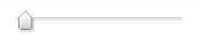
The Slider widget is a UI control that enables the user to adjust values in a finite range along a horizontal or vertical axis. Typically, the Slider widget is used in a web application as a visual replacement for an input box that takes a number as input.
Getting Started
To include the source files for Slider and its dependencies, first load the YUI seed file if you haven't already loaded it.
<script src="http://yui.yahooapis.com/3.11.0/build/yui/yui-min.js"></script>
Next, create a new YUI instance for your application and populate it with the
modules you need by specifying them as arguments to the YUI().use() method.
YUI will automatically load any dependencies required by the modules you
specify.
<script>
// Create a new YUI instance and populate it with the required modules.
YUI().use('slider', function (Y) {
    // Slider is available and ready for use. Add implementation
    // code here.
});
</script>
For more information on creating YUI instances and on the
use() method, see the
documentation for the YUI Global Object.
Using Sliders
Anatomy of a Slider
DOM structure
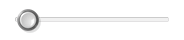
A Slider is comprised of a thumb that slides along a rail. In the DOM, the
thumb is a child of the rail element. The visualization of the rail is
created by applying a CSS background image to the rail element and two
child elements used to display the rail's end caps. The thumb contains two
<img> elements, one for the thumb graphic and one for
its shadow. Using an <img> in the DOM rather than a
background image for the thumb circumvents a performance issue in older
versions of Internet Explorer.
The rail element is contained within the standard contentBox
and boundingBox common to all YUI 3 Widgets.
Like other form controls, Sliders are inline elements.
The complete markup of a Slider is as follows:
Note: be sure to add the yui3-skin-sam classname to the
page's <body> element or to a parent element of the widget in order to apply
the default CSS skin. See Understanding Skinning.
<body class="yui3-skin-sam"> <!-- You need this skin class -->
<!-- boundingBox -->
<span class="yui3-widget yui3-sliderbase yui-slider">
    <!-- contentBox -->
    <span class="yui3-slider-content yui3-slider-x"><!-- or slider-y -->

        <!-- rail -->
        <span class="yui3-slider-rail">
            <span class="yui3-slider-rail-cap-left"></span><!-- or cap-top -->
            <span class="yui3-slider-rail-cap-right"></span><!-- or cap-bottom -->

            <!-- thumb -->
            <span class="yui3-slider-thumb">
                <img class="yui3-slider-thumb-shadow">
                <img class="yui3-slider-thumb-image">
            </span>
        </span>

    </span>
</span>
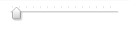
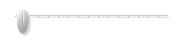
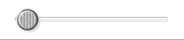
Appearance
This is the appearance of a Slider with default Sam skin applied:
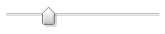
See the skinning section below for tips on creating your own skin or using one of the prepackaged skins available for Slider as of version 3.1.
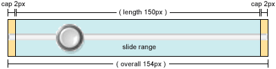
Thumb and end cap placement
The Slider thumb is positioned within the dimensional boundaries of the
rail element. The skin CSS positions the rail's end caps just outside the
rail. The rail element's height or width, for vertical or horizontal
Sliders respectively, is configured by the length attribute.
The default length is 150px. Due to the end caps, the actual
footprint of the Slider is a few pixels longer than the
length.
Instantiating and configuring a Slider
There is no required configuration to instantiate a Slider. By default, Sliders are horizontal, 150px wide, and report values from 0 to 100. Below are the configuration attributes available for Slider (excluding those inherited from Widget):
| Attribute | Description | Default |
|---|---|---|
axis |
Specifies horizontal or vertical Slider ("y" for vertical) | "x" |
min |
Value at the far left or top of the rail | 0 |
max |
Value at the far right or bottom of the rail | 100 |
value |
The initial value, which will be translated into initial thumb placement | 0 |
length |
Height of vertical Slider rail; width of horizontal Slider rail | 150px |
thumbUrl |
The path to an image to use as the <img> for the thumb |
Appropriate thumb image for the configured axis in the current skin |
clickableRail |
Clicking on the rail moves the thumb to that point | true |
Here are a few ways to instantiate a Slider:
YUI({...}).use('slider',function (Y) {

    // Default everything
    var slider = new Y.Slider();
    slider.render("#slider-parent");

    // Use a custom thumb and width
    var slider = new Y.Slider({
        length : '200px',
        thumbUrl : '/path/to/local/thumb-image.png'
    });
    slider.render('#slider-parent');

    // Vertical slider with values that increase from bottom to top and
    // initialize the thumb in the middle.
    var slider = new Y.Slider({
        axis        : 'y',
        min         : 100,
        max         : 0,
        value       : 50
    });
    slider.render('#slider-parent');
});
Setting and constraining the Slider value
Setting and getting Slider values
Like any input element, the most important thing about a Slider is its
value. Though value is managed as an attribute,
Slider provides two convenience methods for accessing it:
getValue()setValue(newVal)
// Specify value at construction
var slider = new Y.Slider({
    value  : 50
});

// Get and set the value as an attribute
var val = slider.get('value');

slider.set('value',val + 10);

// Use the Slider API convenience methods
val = slider.getValue();

slider.setValue(val - 20);
Constraining Slider values
A Slider's value is constrained between the configured
min and max attribute values. Values outside
this range are treated as the closer of min or
max.
// Create a horizontal Slider 300px wide with values from -100 to 100
var slider = new Y.Slider({
    length : 300,
    min    : -100,
    max    : 100
});

slider.setValue(-200); // same as setValue(-100)
By default, min is 0, max is
100 and value is 0.
min and max for vertical Sliders
Vertical Sliders associate the top edge of the rail with the
min value and the bottom edge of the rail with the
max. If you prefer values to increase from bottom to top,
just flip the specified min and max values.
// Create a vertical Slider with value 0 at the bottom, 100 at the top
var v_slider = new Y.Slider({
    axis  : 'y',
    min   : 100, // vertical Sliders have min at the top
    max   : 0,
    value : 33   // initial value
});
Sync the UI if the Slider was rendered off the DOM
If a Slider is rendered off the DOM, you must call the Slider's
syncUI() method after attaching it to the DOM in order for the
thumb to be placed correctly. When off DOM, the dimensional information
necessary to place the thumb is unavailable.
// Create a Slider and render it to an element not on the DOM
var container = Y.Node.create("<div></div>");

var slider = new Y.Slider({ value: 30 });

slider.render( container );

...

// Insert the Slider's container into the DOM
Y.one( "body" ).insert( container );

// Call syncUI() to sync the thumb to the current value
slider.syncUI();
Slider events
Sliders fire the following events during operation:
| Event | When | Payload |
|---|---|---|
slideStart |
Beginning a thumb drag | { ddEvent: (drag:start event) } |
thumbMove |
The thumb position is being changed | { ddEvent : (drag:drag event) } |
valueChange |
The value attribute is changed by any means | Normal change event signature (newVal, prevVal, etc). When dragging, extra event property ddEvent : (drag:drag event) is added |
slideEnd |
Finishing a thumb drag | { ddEvent: (drag:end event) } |
railMouseDown |
The rail was clicked | { ev: (DOM mousedown event) } |
This is not an exhaustive list. See the API docs for a complete listing.
Skinning
Note: be sure to add the yui3-skin-sam classname to the
page's <body> element or to a parent element of the widget in order to apply
the default CSS skin. See Understanding Skinning.
<body class="yui3-skin-sam"> <!-- You need this skin class -->
Using custom thumb or rail images
You can use alternate rail images by specifying a new image path in your CSS, and alternate thumbs can be targeted in the Slider configuration.
<style type="text/css">
/* The rail and end cap images are shared in a sprite.
 * Include the id of the slider container to increase css specificity */
.yui3-skin-sam #slider-parent .yui3-slider-x .yui3-slider-rail,
.yui3-skin-sam #slider-parent .yui3-slider-x .yui3-slider-rail-cap-left,
.yui3-skin-sam #slider-parent .yui3-slider-x .yui3-slider-rail-cap-right {
    background-image: url(/path/to/new/rail.png);
}
</style>

<script>
YUI().use( "slider", function (Y) {

    var slider = new Y.Slider({
        thumbUrl: '/path/to/new/thumb.png'
    });

    slider.render("#slider-parent");

});
</script>
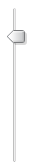
Available skins
Slider is provided with several alternate skins that can be applied by configuring a skin override in your YUI instance configuration.
YUI({
    skin: {
        overrides: {
            slider: [ 'round-dark' ]
        }
    }
}).use( "slider", ... );
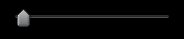
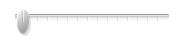
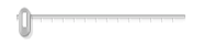
The available skins are each provided in a light and dark theme. A few include optional thumbs or rails (for both light and dark).
| Skin class | Visualization | Optional |
|---|---|---|
yui3-skin-sam |
 |
|
 |
rail-x-lines.png
|
|
yui3-skin-sam-dark |
 |
|
yui3-skin-capsule |
 |
|
 |
thumb-x-line.png
|
|
 |
rail-x-dots.png
|
|
 |
rail-x-lines.png
|
|
yui3-skin-capsule-dark |
 |
|
yui3-skin-round |
 |
|
 |
thumb-x-grip.png
|
|
yui3-skin-audio-light |
 |
|
yui3-skin-audio |
 |
Here's an example illustrating using the capsule skin with provided alternate rail and thumb:
<style type="text/css">
// The rail and end cap images are shared in a sprite
.yui3-skin-capsule .yui3-slider-x .yui3-slider-rail,
.yui3-skin-capsule .yui3-slider-x .yui3-slider-rail-cap-left,
.yui3-skin-capsule .yui3-slider-x .yui3-slider-rail-cap-right {
    background-image: url(/path/to/build/slider-base/assets/skins/capsule/rail-x-lines.png);
}
</style>

<script>
YUI({ skin: { overrides: { slider: [ 'capsule' ] } } })
  .use( "slider", function (Y) {

    var slider = new Y.Slider({
        axis    : 'y',
        min     : 1,
        max     : 5,
        value   : 3,
        length  : '100px',
        thumbUrl: Y.config.base + '/slider-base/assets/skins/capsule/thumb-x-line.png'
    });

    slider.render("#slider-parent");

});
</script>
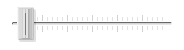
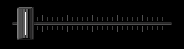
Skin image sprites
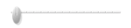
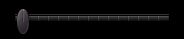
To reduce the number of resource requests for Slider's visual treatment, the rail and end caps are combined into one image sprite, and thumb and shadow into another (examples shown below with borders added for clarity).

Thumb and shadow sprite. As noted above, the thumb
and shadow are both represented as <img>s in the DOM.
This sprite allows both <img>s to reference the same
src URL, but masked and positioned appropriately by the skin
CSS. Thumb image and shadow for vertical Sliders are set next to each
other horizontally as shown. Horizontal Slider thumb sprites are stacked
vertically.

Rail image (repeated across length), top cap, and bottom cap
sprite. This sprite is assigned in the skin CSS as the
background-image for the rail element and the two end caps.
The CSS background for the rail is set to repeat vertically or
horizontally, relative to the Slider axis. The image need be
only as tall (vertical) or wide (horizontal) as the end caps unless the
rail includes a more involved repeating section, such as the audio skin.
End caps should be aligned against the top edge for vertical rails, or the
left edge for horizontal rails.
Standard heights and widths are used for the placement of the image bits within the sprites to allow for minimal differences between the CSS in one skin versus another. This allows you to start from an existing skin and change very little of the CSS (potentially only swapping image URLs) to achieve a new look and feel.
Extending Slider
Slider is built up from a base implementation (Y.SliderBase)
that has no notion of value. It is just a draggable thumb on a rail. The
slider-value-range submodule provides an extension class that
adds the attributes, API, and logic relating the thumb's position to a
value within a minimum and maximum
range. Similarly, the clickableRail implementation is
relegated to an extension class. These classes are combined with
Y.Base.build to generate the Y.Slider class.
If you want to use a different value algorithm or decorate the basic Slider
in other ways, you can write an extension class or Y.extend an
existing extension class and create a new Slider implementation with
Y.Base.build.
YUI().use( "slider-base", function (Y) {

    // Define a new extension class to calculate values differently
    function MyValueClass() {
        this._initValueAlgo();
    }

    // Add attribute configuration and prototype to decorate the Slider
    Y.mix( MyValueClass, {

        ATTRS: { /* new configuration attributes */ },

        prototype: { /* additional prototype members and methods */ }
    });


    // Combine SliderBase with the new extension class any others to
    // create a new Slider
    Y.MySlider = Y.Base.build( "slider", Y.SliderBase, [
        Y.ClickableRail,  // Should also support rail clicks
        MyValueClass      // Use the new value methods and attributes
    ] );


    // Instantiate and use the new Slider class as you would Y.Slider
    var slider = new Y.MySlider({ /* config */ });

    slider.render( "#slider-parent" );

});