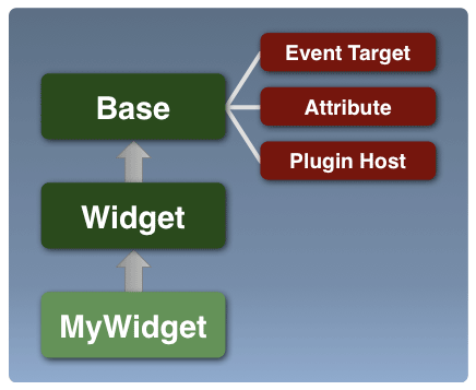
Widget is the foundation class from which all YUI 3 widgets are derived. It provides the following pieces of core functionality on top of what Base already provides:
- Adds the
renderlifecycle moment, to Base'sinitanddestroymoments - Abstract rendering methods to promote a consistent MVC pattern across widgets
- A common set of widget attributes
- Consistent markup generation support
- Consistent class-name generation support
- Built-in progressive enhancement support
What Widget Provides
Class Structure And Responsibilities
Widget provides the foundation class on which all YUI 3 widgets will be built.
Although instantiable and usable by itself, it is designed to be extended to create widgets which address
specific user interaction patterns.
The Widget class extends Base. Therefore it provides
the same Attribute, Event.Provider and Plugin.Host support as Base does.
It adds the following core functionality:
- Basic Attributes
- It introduces a common set of attributes that will be available on any widget.
For example,
boundingBox,contentBox,width,height,visible,focusedanddisabled. - Render Lifecycle Phase
- It adds the
renderlifecycle method (and event) to theinitanddestroylifecycle methods provided byBase. - Abstract Rendering Methods
- It establishes abstract methods
renderUI,bindUIandsyncUIto provide consistent entry points for rendering across all widgets. - Consistent Progressive Enhancement
- It provides a common entry point for Progressive Enhancement during widget initialization and also provides the infrastructure to hide progressively enhanced markup to avoid flashes of unstyled content.
- String Localization
-
The
stringsattribute provides a consistent API for string management in all Widgets. Widget developers can define strings for their widget in an external language bundle when packaging their widgets as a YUI module, and use the Internationalization utility to pull in strings for a given locale as demonstrated in the Language Resource Bundles example. init(inherited fromBase):-
The
initmethod loops through the class hierarchy, top down (Base first, subclass last) and:- Configures attributes for each class, based on the class'
ATTRSstatic property. - Then, invokes the
initializermethod for the class.
The
initmethod fires aninitevent, which can be prevented to stop initialization from proceeding. - Configures attributes for each class, based on the class'
destroy(inherited fromBase):-
Invokes the
destructormethod for all classes in the widget hierarchy, bottom up (subclass first, Base last).The
destroymethod fires adestroyevent, which can be prevented to stop destruction from proceeding. render:-
Invokes the
renderermethod for the Widget instance. Unlike theinitializeranddestructor, this method is not chained automatically for the widget's class hierarchy.The
rendermethod accepts aparentNodeargument, which can be used to specify an existing node in the document, where the widget should be appended, when rendered. If the widget's contentBox or boundingBox don't already exist in the document, and theparentNodeargument is not provided, the widget is inserted as the first child of the document's body element (we insert as the default behavior, to avoid IE6 "Operation Aborted" errors).The
rendermethod fires arenderevent, which can be prevented to stop rendering from proceeding. renderUI- This method is responsible for creating and adding the nodes which the widget needs into the document (or modifying existing nodes, in the case of progressive enhancement). It is usually the point at which the DOM is first modified by the widget.
bindUI- This method is responsible for attaching event listeners which bind the UI to the widget state. These listeners are generally attribute change listeners — used to update the state of the UI in response to changes in the attribute's value. It also attaches DOM event listeners to the UI to map user interactions to the widget's API.
syncUI- This method is responsible for setting the initial state of the UI based on the current state of the widget at the time of rendering.
- If JavaScript is not enabled the content provided by the markup for the widget, should be visible and accessible.
- If JavaScript is enabled, the widget source markup should be hidden as early as possible, to avoid the user seeing the flash of unstyled content while the widget's JavaScript and CSS components are delivered to the page and the widget is rendered.
- Once the widget is fully rendered it should then be displayed.
-
The YUI seed file will stamp the documentElement (the <HTML> element) with a class of
'yui3-js-enabled'. -
Application developers can then add a class name representing the "loading" state, to the widget's content (e.g.
'yui3-widget-loading').This class can be used in combination with the "yui3-js-enabled" class name to create style rules to hide the widget content while its JavaScript is being loaded.
.yui3-js-enabled .yui3-widget-loading { display: none; } .yui3-js-enabled .yui3-overlay-loading { /* Hide overlay markup offscreen */ position:absolute; top:-1000em; left:-1000em; }As shown in the example above, there is support for use of both a generic widget and type-specific widget class name by default ("yui3-widget-loading" and "yui3-tabview-loading").
-
Widget's renderer will remove the "loading" class names from both the bounding box and content box once the widget is rendered, allowing the fully functional widget to be revealed.
A class name identifying the widget is added to the bounding box.
The default format for the class name is "yui3-[widgetname]". For example, for Slider, the "yui3-slider" class name is added to the bounding box.
Additionally, class names for all widget classes in the class hierarchy are also used to tag the bounding box.
For example, for a MultiThumbSlider, which may extend Slider, the bounding box is marked with the classes "yui3-widget", "yui3-slider" and "yui3-multithumbslider" (this is the only place where we mark an element with class names for all widget classes in the hierarchy).
-
Class names used for state management by the widget instance are also applied to the bounding box.
The general format is "yui3-[widgetname]-[state]". For example "yui3-slider-hidden", "yui3-slider-disabled".
-
The widget's width and height values are applied to the bounding box if set, as are top/left (xy) positioning values, for positioned widgets.
-
The bounding box is not expected to have any visual properties (e.g. borders, padding, etc.) applied to it.
However it will have CSS defining how the widget impacts the document flow. For example, the bounding box type ("display:inline", "display:inline-block", "display:block") and the positioning scheme ("position:absolute", "position:relative").
-
The content box also has an identifying class name applied to it.
The default format is "yui3-[widgetname]-content". For example "yui3-slider-content".
Visual treatment for the widget is applied to the content box (e.g. borders, padding, background-color, etc.).
-
For progressively enhanced solutions, generally the application developer will only provide what will be the content box on the page and pass it into the constructor as the
srcNode(rather than the bounding box).The bounding box will be added dynamically when the widget is instantiated. This maintains semantic value (the content box ends up containing existing content), and avoids unnecessary markup on the page up front.
- The nested structure allows the bounding box to act as a container for any additional decorator elements which need to be added for the widget, for example, elements which support rounded-corners, shadows, or shimming. These can live as siblings of the content box, and can be positioned and sized more efficiently since they have a common parent container.
- Additionally, due to the consistent structure across all widgets, generic plugins can be written to provide the above decorator support, which are re-usable across all widgets.
- Having a box without border and padding applied (the bounding box) allows for consistent width and height application across browser box model differences.
- Instance Method:
getClassName(arg1, arg2, arg3 ...) -
This method can be used to create class names which begin with the configured prefix for the application ("yui3-" by default) and the name of the widget (the
NAMEproperty, lowercase). For example:// A method on a Spinner widget instance, // with Spinner.NAME = "spinner"; renderSpinnerButton: function() { // generates the class name "yui3-spinner-increment-major" var btnClassName = this.getClassName("increment", "major"); }Note: The
ClassNameManager.getClassName(arg1, arg2, arg3 ...)method can be used as a replacement for the above method, when class names need to be generated in a static context, by passing in the widget implementation'sNAMEproperty as the first argument. For example:// Generates the class name "yui3-spinner-button" Spinner.BUTTON_TEMPLATE = Y.ClassNameManager.getClassName( Spinner.NAME, "button"); - Static Method:
Widget.getClassName(arg1, arg2, arg3 ....) -
This static version of the method (invoked directly on the
Widgetclass, as opposed to "this") can be used to create class names which begin with a "yui3-widget" prefix. This maybe useful for plugins, which need to ship with CSS which targets a fixed class name, regardless of the widget instance to which they are applied. For example:// generates the class name "yui3-widget-shim" Widget.getClassName("shim"); -
Widget developers don't have to explicitly publish a given UI event in order for Widget consumers to listen for them.
For performance, these events are only created when someone is listening, and the actual firing of these events is facilitated by a single, delegated DOM event listener.
-
Widget developers can still choose to publish any given UI event in order to explicitly control some aspect of the event.
The most likely use case is the desire to provide the default implementation/handler for a given event. For example: a developer might want to publish a
"click"event for a Menu widget with the goal of providing the default click behavior/function. -
The set of DOM events published by widget is defined by the UI_EVENTS prototype property.
This property defaults to
Node.DOM_EVENTS. Widget developers can use this property to pare down or extend the number of events that are published and fired automatically. - Extensions - A Class Level Concept
-
Extensions provide features which can be mixed and matched at the class level.
Extensions are used by widget developers to create new widget classes which share the extension functionality.
If it contains functionality which is not optional for the class, it's an extension.
Something baked into the class, but implemented so that it can also be re-used to build other classes.
-
WidgetParent, WidgetChild and WidgetPosition, WidgetStack are good examples of extensions.
A
Treewidget class always needs Parent/Child support. However, so does aMenuwidget class. We want to reuse the Parent/Child support across both classes, without forcing them to extend a shared base class. Additionally, the Parent/Child functionality is a required for both classes; it is not optional. Extensions are applied to a class using the static
Base.buildmethod (or theBase.createorBase.mixsugar methods which sit on top ofBase.build).
- Plugins - An Instance Level Concept
-
Plugins provide features which can be mixed and matched at the instance level.
Plugins are used by application developers to apply features to certain instances of a widget.
If it contains functionality which is not required for all instances of the class, it's a plugin.
A feature which you may only want to apply to one instance, out of the ten instances of your widget on a page, is a plugin.
-
The Animation and IO plugin examples are good use cases.
You don't want to have to bake Animation or IO support into a class (potentially resulting in the need to ship
MyAnimatedWidget,MyIOEnabledWidget,MyAnimatedAndIOEnabledWidgetandMyWidgetclasses). The functionality is optional and can be plugged into just the instances of the singleMyWidgetclass which need them. Plugins are applied to an instance using the instance's
plugmethod.
- widget-parent
- Adds support to allow the widget to contain, manage and select child widgets:
-
It provides a consistent API for creating parent/child relationships:
parent.add(child, n); parent.remove(n);
These can be single level relationships (e.g. Tabs in a TabList, or Buttons in a Toolbar) or nested hierarchical relationships (e.g. Menus and MenuItems, or Trees and TreeNodes).
Parents are automatically set up as event targets for their children's events, allowing you to leverage custom event bubbling to listen for events higher up in the hierarchy.
Parents automatically render their children when rendered.
-
Widget Parent augments the ArrayList API, providing a full range of iteration and traversal methods for it's children:
parent.each(function(child) {...}); parent.item(n); parent.indexOf(child); parent.size(); It also provides selection support, including support for non-binary selection states (all, none, some).
Finally, it provides a sugar layer to simplify adding children to the parent during construction, by supporting an object literal format to initialize children.
var tabview = new Y.TabView({ children: [{ label: 'foo', content: '<p>foo content</p>' }, { label: 'bar', content: '<p>bar content</p>' }] });
-
- widget-child
-
Adds support to allow the widget to be contained within a widget parent.
Used together with widget-parent, allows you to support hierarchical parent/child structures. As with Widget Parent, it provides a consistent API for child widgets to interact with their siblings and parents, e.g.,
child.next(),child.previous()andchild.ancestor(). - Using Extensions: Building Custom Widget Classes
- Widget-Position, Widget-Stack: A Simple Tooltip Widget
- Widget-Parent, Widget-Child: A Hierarchical ListBox Widget
- Overlay
Uses widget-position, widget-position-align, widget-position-constrain, widget-stack, widget-stdmod
- TabView
Uses widget-parent, widget-child
- Widget Animation Plugin (api documentation)
- Widget (and Node) Drag/Drop Plugin (api documentation)
- Creating Widget Plugins (example)
- Creating An Overlay IO Plugin (example)
- Creating An Overlay Animation Plugin (example)
Basic Attributes
Widget establishes a common set of attributes which will be available in all YUI 3 widgets. The core attributes are discussed below:
| Attribute | Description |
|---|---|
boundingBox | The widget's outermost node, used for sizing and positioning; this element can also serve as a containing node for any decorator elements used for skinning. |
contentBox | A node that is a direct descendant of a widget's bounding box and houses its content. This will generally be the node that establishes the look and feel for the widget. |
srcNode | An existing node in the document provided by application developers when progressively enhancing existing markup to create the widget. By default, this resolves to the contentBox. |
tabIndex | The tabIndex, applied to the bounding box. |
focused | Flag, indicating if the widget currently has focus. Widget marks the bounding box with a "focused" class, but other than that the focus implementation is left to the specific widget class. |
disabled | Flag, indicating if the widget is disabled. Widget marks the bounding box with a "disabled" class, but other than that the disabled implementation is left to the specific widget class. |
visible | Flag, indicating whether or not the widget is visible. Widget marks the bounding box with a "hidden" class. The hidden implementation is left to the CSS delivered by the specific widget class (viz. whether or not the widget uses visibility, display or off screen positioning to actually hide the widget). |
height | String with units, or a number, representing the height of the widget. If a number is provided, the default unit, defined by Widget's DEF_UNIT, property is used. The height is applied to the bounding box. |
width | String with units, or a number, representing the width of the widget. If a number is provided, the default unit, defined by Widget's DEF_UNIT, property is used. The width is applied to the bounding box. |
strings | The collection of strings used to label elements of the widget's UI. These should ideally be packaged separately from the Widget code, as discussed in the Language Resource Bundles example. |
Rendering Methods
Widget adds the render method/lifecycle phase to the
init and destroy phases established by Base.
The render method establishes the point at which the widget lays down its UI by adding elements to (or modifying existing elements in) the DOM and
setting up listeners to activate that UI. Having a distinct rendering phase promotes widget classes that separate state and corresponding logic
from the way the widget UI is displayed. This separation tends to allow the widget's state to be safely modified and queried before it is displayed or rendered to the DOM.
Additionally, this separation of concerns leads to code being split into methods that manipulate the widget's state or handle core "app" logic versus methods which work with the DOM. Following this practice makes it easier to customize and test one area or the other.
The Lifecycle Methods: init, destroy, render
As with init and destroy, the render method on Widget is final and delegates to the
widget implementation's renderer method to perform the actual rendering work:
Widget's renderer Method
Widget provides a renderer method implementation, which for most simple widgets will not need to be over-ridden.
This renderer method is shown below:
renderer: function() {
    this.renderUI();
    this.bindUI();
    this.syncUI();
}
The renderUI, bindUI and syncUI are abstract (empty) methods in the Widget class which attempt to establish a common pattern for widget development.
The intended role of each of these methods is described below, and most widgets will simply implement these methods based on their expected roles:
Progressive Enhancement
The Widget class establishes a standard entry point for widgets that need to provide support for Progressive Enhancement; this entry point is provided in the form of an HTML_PARSER property on each class.
HTML_PARSER is a static property, used to define a hash of selectors or functions that are responsible for (a) parsing content for the widget from existing DOM elements and (b) extracting attribute configuration values for use during initialization.
MyWidget.HTML_PARSER = {

     // Set attributes which are Node references
     // using selector syntax (uses node.one())
     titleNode: "span.yui3-title",

     // Set attributes which are multiple Node references
     // using selector syntax (uses node.all())
     itemNodes: ["li.yui3-listitem"],

     // Set attributes using a parse function. Execution context
     // is set to the widget instance
     label: function(srcNode) {
        return srcNode.one("input.yui3-title").get("innerHTML");
     },

     xValue: function(srcNode) {
         return srcNode.one("input.yui3-slider-xvalue").get("value");
     },

     yValue: function(srcNode) {
         return srcNode.one("input.yui3-slider-yvalue").get("value");
     }
};
The HTML_PARSER property is evaluated when the Widget class' initializer method is invoked (so Widget sub-classes receive the configuration
object passed into the constructor). The object is iterated, to create a filled out configuration object for the widget, based on the content the user points to using the srcNode attribute.
For example, the parser definition above may lead to the following object literal when evaluated:
{
    titleNode: NodeRef,
    itemNodes: NodeListRef (multiple nodes),
    label: "My Widget",
    xValue: "10",
    yValue: "20"
}
This object is merged with the user configuration object passed into the constructor (markup can be thought of as alternate source/format for configuration data), with the configuration object passed to the widget constructor taking precedence if a value for an attribute is found in both places.
Hiding Progressively Enhanced Markup
In addition to providing a common entry point for progressively enhanced solutions through the HTML_PARSER, Widget also provides the CSS hooks you need to initially hide content which will be progressively enhanced.
In order to make this happen:
Rendered Markup
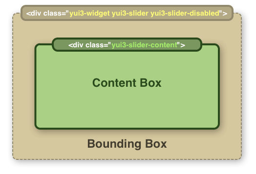
The Widget class establishes a common markup format for all widgets, through its boundingBox and
contentBox attributes.
Most widgets will have a bounding box wrapping a content box. They are both DIVs by default but can be customized by overriding the BOUNDING_TEMPLATE and CONTENT_TEMPLATE prototype properties.
However, the widget developer can also specify the CONTENT_TEMPLATE to be null, if their widget implementation does not require a two-box structure. In this case, both the boundingBox and contentBox attributes will point to the same node.
The widget will create either of the nodes if they are not provided in the constructor, and add them to the document when the widget's render method is called.
As mentioned previously, if the render method is passed a node reference, the widget's bounding box is appended to that node.
The Bounding Box
The bounding box is the outermost element owned by the widget and is used for functional, rather than visual, purposes.
The Content Box
The content box is a child of the bounding box. The widget will add the elements which make up its core UI inside the content box.
Widget Markup Diagram
The following illustration demonstrates how the markup and class names for a widget's bounding box and content box come together.
Why Two Nested Boxes?
Providing nested boxes for all widgets provides benefits for CSS application, decorative element support and bounding box dimension handling. These are detailed below:
Class Names and CSS
In order to provide consistent class names for use across all widgets, the Widget class provides two methods which are simple wrappers for the ClassNameManager utility, and leverage the NAME property defined for widget classes.
If, as a custom widget developer, you want to override the default prefix (yui3-[widgetname]), you can define a static CSS_PREFIX property on your
widget's constructor function and CSS classnames will be prefixed with the value you set CSS_PREFIX to.
// Define a custom css prefix
MyWidget.CSS_PREFIX = "myapp-common";

// Inside your widget code:
_renderUI : function() {
    // Generates the class name "myapp-common-selected",
    // instead of "yui3-mywidget-selected"
    var selectedClassName = this.getClassName("selected");
}
CSS Implications
As a best practice, Widget avoids using the style attribute to control state such as "visible", "disabled" or "focused". Instead it marks the bounding box with class names which reflect the state:
| Attribute/State | CSS Class Applied |
|---|---|
| visible | yui3-[widgetname]-hidden |
| disabled | yui3-[widgetname]-disabled |
| focused | yui3-[widgetname]-focused |
In the above definitions, "[widgetname]" is the name of the widget (e.g. "menu", "overlay", "slider").
The widget name is combined with the state identifier so that different widgets can customize the way they handle visibility differently, and still work with IE6,
where multiple class name rules, like .yui3-menu.yui3-hidden are not well supported. For example:
/* Hide by positioning off-screen */
.yui3-menu-hidden {
    top:-10000em;
    left:-10000em;
}

/* Hide by flipping visibility */
.yui3-overlay-hidden {
    visibility:hidden;
}

/* Hide by flipping display */
.yui3-slider-hidden {
    display:none;
}
However, providing an IE6-compatible format requires each widget to ship with the CSS rules defined for each of its states. Of the state-based rules above, all widgets will definitely end up providing a "yui3-[widgetname]-hidden" implementation to control visibility. Whether or not CSS rules for the other two states are provided is usually a function of whether or not the widget needs special UI handled for the "disabled" and "focused" states.
Default UI Events
Widget publishes and fires custom events for any DOM events ("click", "mouseover" etc.) which get fired inside its bounding box.
Like all other Widget custom events, these events are prefixed with the widget's name (e.g. 'menuitem:click') and
the default context of the event listener will be the widget that fired the event (as opposed to the Node firing the DOM event).
These events provide application developers the ability to listen for UI events as part of the logical widget API, without having to be concerned with the DOM elements which make up the widget's UI.
Since these are events that many Widget instances are going to want to publish and fire, Widget does this by default to ensure that these events are fired in a performant, consistent way across Widget implementations.
Developing Your Own Widgets
To create your own widget, you'll create a class which extends Widget and implements the properties and methods shown in the diagram below:
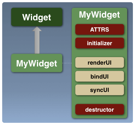
The best place to start is by defining the attributes which make up your widget (the ATTRS static property). These will help define the state and API which your widget exposes to the application developer.
You can then implement the initializer, destructor, renderUI, bindUI and syncUI methods, based on the responsibilities defined for them above,
along with the methods which support the attribute state handling and API.
The "Extending The Widget Class" example walks you through the step-by-step process involved in implementing a Spinner widget using this template structure. The example along with the template file should provide a good jumping off point for developing your own widgets.
Additionally, the template structure shown above is captured in this "MyWidget" template file, which you can use as a starting point to develop your own widgets.
Plugins And Extensions
In addition to being able to subclass any given Widget class to provide custom widget implementations, YUI 3 also provides two additional code reuse mechanisms which can be used to package and reuse code to provide new widgets features, without being bound to a static all-or-nothing class hierarchy. These code reuse mechanisms are known as Plugins and Extensions and support for both of them is provided through Base.
Generally widget developers should aim to provide the core set of features or functionality for any widget by sub-classing Widget or an existing class derived from Widget using Y.extend.
Additional incremental features or functionality should be packaged into extensions or plugins so they can be reused across classes (in the case of extensions), or instances (in the case of plugins).
Plugin or Extension?
The question about whether a given piece of incremental functionality should be a Plugin or an Extension comes up frequently, and it's a design decision widget developers need to consider based on use cases for their widget.
As mentioned above, both Plugins and Extensions provide a mechanism to write and deliver atomic, incremental pieces of functionality which add to the core implementation. Where they differ is discussed below:
Widget Extensions
As you start to develop widgets in YUI 3, there are a number of extensions packaged as part of the library which you can use with Base.build (or Base.create, Base.mix) to add functionality to your custom widget classes:
| Extension | Functionality |
|---|---|
| widget-position | Adds XY positioning support to the class. |
| widget-position-align | Adds XY aligned positioning support to the class. |
| widget-position-constrain | Adds constrained XY positioning support to the class. |
| widget-stack | Adds stacking (zIndex) support to the class. |
| widget-stdmod | Adds Standard Module (header, body, footer) support to the class. |
| widget-parent | Adds support to allow the widget to contain, manage and select child widgets. |
| widget-child | Adds support to allow the widget to be contained within a widget parent. |
| widget-buttons | Adds header/body/footer buttons support for Widgets that use the WidgetStdMod extension. |
| widget-autohide | Adds support to hide the widget when certain DOM events occur. |
| widget-modality | Adds support for modality to widgets. |
The functionality provided by the widget-parent and widget-child extensions, allowing widget developers to build nested widgets, is worth discussing in a little more detail:
Below are some examples showing how you can use some of these extensions:
You can also look at some of the bundled widgets which are built using extensions:
The "MyExtension" template file provides a starting point for you to create your own extensions.
Widget Plugins
The YUI 3 library ships with a couple of Widget plugins for the 3.1.0 release, and also provides examples which show how you can create your own plugins:
Additionally, the YUI Gallery is another source for plugins which provide additional functionality for YUI Widgets, such as the Modal Overlay Plugin and the Widget IO Plugin.
The "MyPlugin" template file provides a starting point for you to create your own plugins.