 The Charts module provides a JavaScript API for visualizing data in a variety of formats across a browser test baseline. Based on device and browser capabilities, Charts leverages SVG, HTML Canvas and VML to render its graphical elements.
The Charts module features a Chart class that allows you to easily create a chart from a set of data. Chart extends Widget and includes configurable attributes that enable you to customize a Chart. Currently, the Chart widget can be used to create different variations and combinations of line, marker, area, spline, column, bar and pie charts.
Getting Started
To include the source files for Charts and its dependencies, first load the YUI seed file if you haven't already loaded it.
<script src="http://yui.yahooapis.com/3.11.0/build/yui/yui-min.js"></script>
Next, create a new YUI instance for your application and populate it with the
modules you need by specifying them as arguments to the YUI().use() method.
YUI will automatically load any dependencies required by the modules you
specify.
<script>
// Create a new YUI instance and populate it with the required modules.
YUI().use('charts', function (Y) {
    // Charts is available and ready for use. Add implementation
    // code here.
});
</script>
For more information on creating YUI instances and on the
use() method, see the
documentation for the YUI Global Object.
Using the charts widget
This section describes how to use the charts widget in further detail. It contains these subsections:
Instantiating A Chart
All you need to instantiate a chart is
- A div container to render the chart.
- An array to provide data for the chart.
*NOTE: By default, the chart will size itself to the dimensions of its container div. Be sure to include a width and height as demonstrated below:
CSS
#mychart {
    width: 600px;
    height: 400px;
}
HTML
<div id="mychart"></div>
JavaScript
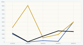
// Data for the chart
var myDataValues = [
    {category:"5/1/2010", values:2000},
    {category:"5/2/2010", values:50},
    {category:"5/3/2010", values:400},
    {category:"5/4/2010", values:200},
    {category:"5/5/2010", values:5000}
];

// Instantiate and render the chart
var mychart = new Y.Chart({
    dataProvider: myDataValues,
    render: "#mychart"
});
By default, Chart creates a graph with lines and markers. This can be changed through the type attribute. Available values are listed below:
| Type | Description |
|---|---|
area |
Visualizes quantitative data with a fill between an axis and relevant data points. |
areaspline |
An Area Chart in which data points are connected by a curve. |
bar |
Visualizes bars positioned vertically along a category or time axis. The bars' lengths are proportional to the values they represent along a horizontal axis. |
column |
Visualizes bars positioned vertically along a category or time axis. The bars' lengths are proportional to the values they represent along a horizontal axis. |
combo |
Combination of line, marker and area chart. By default, there is no area fill. This is the default type for a Chart. |
combospline |
A combo chart in which the data points are connected by a curve. |
line |
Visualizes quantitative data on a graph by connecting relevant data points. |
markerseries |
Visualizes quantitative data by plotting relevant data points on a graph. |
pie |
A circular chart divided into wedges which represent data as a percentage of a whole. |
spline |
Visualizes quantitative data on a graph by connecting relevant data points with a curve. |
Chart Application
The Chart class acts as a facade for two underlying application classes:
- CartesianChart
- An application used to render multiple series to a graph with x and y axes. Many series can be rendered in a CartesianChart.
- PieChart
- An application used to render Pie Charts.
When Chart is instantiated, the type attribute determines which class instance will be returned. A value of pie will return an instance of
PieChart. All other values will return an instance of CartesianChart. For the most part, this is a distinction that only occurs under the hood. As a
developer, this can be viewed as a single API.
Attributes
The Chart widget adds the following key attributes, in addition to the attributes provided by the base Widget class:
| Property | Type | Description |
|---|---|---|
axes |
Object |
Axes to appear in the chart. This can be an object of axis instances or object literals used to construct the appropriate axes. |
categoryAxis |
Axis |
Reference to the chart's category axis. |
categoryAxisName |
String |
Indicates the key value used to identify a category axis in the axes hash. If not specified, the categoryKey attribute value will be used. |
categoryKey |
String |
The key value used for the chart's category axis. The default value is category. |
categoryType |
String |
Indicates whether to use a CategoryAxis or TimeAxis for the Chart instance's category axis. The default value is category. |
dataProvider |
Array |
Array of data used to construct the chart. |
direction |
String |
Direction of chart's category axis when there is no series collection specified. Charts can be horizontal or vertical. When the chart type is column, the chart is horizontal. When the chart type is bar, the chart is vertical. |
horizontalGridlines |
Gridlines |
Reference to the horizontalGridlines for a cartesian chart. |
interactionType |
String |
Indicates the the Chart instance will fire marker or planar events. The default value is marker. |
legend |
Object |
Provides a legend for a Chart. |
seriesCollection |
Array | Collection of series to appear on the chart. This can be an array of Series instances or object literals used to construct the appropriate series. |
seriesKeys |
Array |
A collection of keys that map to the series axes. If no keys are set, they will be generated automatically depending on the data structure passed into the chart. |
showAreaFill |
Boolean |
Indicates whether or not an area is filled in a combo chart. |
showLines |
Boolean |
Indicates whether to display lines in a combo chart. |
showMarkers |
Boolean |
Indicates whether to display markers in a combo chart. |
stacked |
Boolean |
Indicates whether or not the chart is stacked. |
styles |
Object |
properties for the chart. |
tooltip |
Object |
Reference to the default tooltip available for the chart. |
type |
String |
Indicates the default series type for the chart. The default value is combo |
valueAxisName |
String |
Indicates the key value used to identify the default value axis. |
verticalGridlines |
Gridlines |
Reference to the verticalGridlines for a cartesian chart. |
The dataProvider Attribute
The only required attributes for instantiating a Chart instance are dataProvider and render. The render attribute can be included
in the configuration argument or called explicitly after instantiation.
mychart.render("#mychart");
The Chart widget requires an array for its source of data. The Chart widget will accept an array of object literals or arrays. When an array of arrays
is received, the values in the first index will be used for the category axis and all subsequent indices will be used for the value axis/axes. When an array of object literals is
received, all records with a key matching the categoryKey attribute will be used for the category axis with all other records used for the value axis/axes.
Multi-dimensional Array
var myDataValues = [
    ["5/1/2010", "5/2/2010", "5/3/2010", "5/4/2010", "5/5/2010"],
    [2000, 50, 400, 200, 5000]
];
Object Literal Array
var myDataValues = [
    {category:"5/1/2010", values:2000},
    {category:"5/2/2010", values:50},
    {category:"5/3/2010", values:400},
    {category:"5/4/2010", values:200},
    {category:"5/5/2010", values:5000}
];
The underlying structure of the dataProvider is an array of object literals. If a Chart receives a multi-dimensional array for its
dataProvider, it will convert the array to an array of object literals.
Using the tooltip Attribute
The Chart class comes with a built-in simple tooltip. This tooltip can be customized or disabled with the tooltip attribute which contains the following
properties:
| Property | Type | Description |
|---|---|---|
hideEvent | String/Array | Event that hides the tooltip. This allows you to specify which mouse event(s) hides the tooltip. You can also pass this an array of events and each event in the array will hide the tooltip. The default value is mouseout. |
markerEventHandler | Function | Displays and hides a tooltip based on marker events. |
markerLabelFunction | Function | Reference to the function used to format a marker event triggered tooltip's text. The markerLabelFunction has the following arguments:
HTMLElement which is written into the DOM using appendChild. If you override this method and choose to return an html string, you
will also need to override the tooltip's setTextFunction method to accept an html string.
*NOTE: Previous to 3.5.0, this method used tooltip: {
setTextFunction: function(textField, val) {
textField.setHTML(val);
}
}
If you use such a strategy, please ensure your content is safe.
|
node | HTMLElement | Reference (read-only) to the actual dom node of the tooltip. |
planarEventHandler | Function | Displays and hides a tooltip based on planar events. |
planarLabelFunction | Function | Reference to the function used to format a planar event triggered tooltip's text. The planarLabelFunction has the following arguments:
HTMLElement which is written into the DOM using appendChild. If you override this method and choose to return an html string, you
will also need to override the tooltip's setTextFunction method to accept an html string.
*NOTE: Previous to 3.5.0, this method used tooltip: {
setTextFunction: function(textField, val) {
textField.setHTML(val);
}
}
If you use such a strategy, please ensure your content is safe.
|
| setTextFunction | Function | Method that writes content returned from planarLabelFunction or markerLabelFunction into the the tooltip node.
has the following signature:
|
show | Boolean | Indicates whether to show a tooltip. |
showEvent | String | Event that triggers the tooltip. This allows you to specify which mouse event will cause the tooltip to display. The default value is mouseover |
styles | Object | Hash of CSS styles that are applied to the tooltip's node. |
Styling a CartesianChart with the styles Attribute
The styles attribute can be used to update the properties of different chart components in a CartesianChart.
| Property | Type | Description |
|---|---|---|
axes | Object | An object containing references to the styles attribute for each Axis instance in the chart. |
graph | Object | A reference to the styles attribute of the chart applications's Graph. |
series | Object | An object containing references to the styles attribute for each CartesianSeries instance in the chart. |
Using the axes Attribute
The axes attribute allows you to specify axes to be used in the chart. The axes attribute contains a hash of either Axis instances or
object literals containing information that the Chart will use to create axes. The most common use case is to use object literals. Below are the attributes available:
| Property | Type | Description |
|---|---|---|
alwaysShowZero | Boolean | Ensures that zero appears on a NumericAxis when minimum and maximum are not explicitly set. |
keys | Array | An array keys used to bind data from the dataProvider to the axis. |
labelFormat | Object | Template for formatting labels. Used by labelFunction in NumericAxis and TimeAxis instances. For TimeAxis instances the labelFormat is an STRFTime string. For NumericAxis instances the labelFormat is an object literal containing the following properties:
|
labelFunction | Function | Function used to format axis labels for display. The return value is added to the Axis with appendChild.
*NOTE: Previous to 3.5.0, this method used appendLabelFunction: function(textField, val) {
textField.innerHTML = val;
}
If you use such a strategy, please ensure your content is safe.
|
appendLabelFunction | Function | Function used to add the output of the labelFunction to the Axis using appendChild. This attribute can be overridden
as needed. |
title | String | Optional attribute that allows for specification of an axis title. The value of this attribute is added to the Axis with appendChild.
*NOTE: Previous to 3.5.0, this attribute was added to the DOM using appendTitleFunction: function(textField, val) {
textField.innerHTML = val;
}
If you use such a strategy, please ensure your content is safe.
|
appendTitleFunction | Function | Function used to add the title attribute to the Axis using appendChild. This attribute can be overridden as needed. |
maximum | Object | The maximum value to display on an axis. (TimeAxis and NumericAxis only) |
minimum | Object | The minimum value to display on an axis. (TimeAxis and NumericAxis only) |
position | String | Position in relationship to the graph in which to place the axis. (top, right, bottom, left) |
roundingMethod | String | Algorithm used for rounding units on a NumericAxis when minimum and maximum are not explicitly set. |
Referencing Series and Axis Instances
Sometimes you'll want to update an axis or a series after a chart has been instantiatied. This can be done with the Chart's getAxisByKey and
getSeries methods. The getAxisByKey method looks up and returns an Axis instance based on its a key reference.
Using getAxisByKey
var leftAxis = mychart.getAxisByKey("values");
leftAxis.set("styles", {label:{rotation:-45}});
The getSeries method will accept either an index or a key reference and return a series.
Using getSeries with a Key
var mySeries = mychart.getSeries("category");
mySeries.set("visible", false);
Using getSeries with an Index
var mySeries = mychart.getSeries(0);
mySeries.set("visible", false);
Using the legend Attribute
The legend attribute allows you to define a legend for your Chart instance. The legend is an object containing the attributes necessary for defining and
styling the legend. You must include the 'charts-legend' module if you want have legends in your chart.
YUI().use('charts-legend', function (Y) {
    // Charts is available and ready for use. Add implementation
    // code here.
});
To see how to create a chart with a legend, check out the example. Below is a list of the available attributes.
| Property | Type | Description |
|---|---|---|
| chart | Chart | Reference to the Chart instance. |
| direction | String | Indicates the direction in relation of the legend's layout. The direction of the legend is determined by its position value. |
| position | String | Indicates the position and direction of the legend. Possible values are left, top, right and bottom. Values of left and
right values have a direction of vertical. Values of top and bottom values have a direction of horizontal. |
| width | Number | The width of the legend. Depending on the implementation of the ChartLegend, this value is readOnly. By default, the legend is included
in the layout of the Chart that it references. Under this circumstance, width is always readOnly. When the legend is rendered in its own dom element, the
readOnly status is determined by the direction of the legend. If the position is left or right or the direction is vertical, width is readOnly.
If the position is top or bottom or the direction is horizontal, width can be explicitly set. If width is not explicitly set, the width will be determined
by the width of the legend's parent element. |
| height | Number | The height of the legend. Depending on the implementation of the ChartLegend, this value is readOnly. By default, the legend is included
in the layout of the Chart that it references. Under this circumstance, height is always readOnly. When the legend is rendered in its own dom element, the
readOnly status is determined by the direction of the legend. If the position is top or bottom or the direction is horizontal, height is readOnly.
If the position is left or right or the direction is vertical, height can be explicitly set. If height is not explicitly set, the height will be determined
by the width of the legend's parent element. |
| x | Number | Indicates the x position of legend. |
| y | Number | Indicates the y position of legend. |
| styles | Object |
Properties used to display and style the ChartLegend. This attribute is inherited from Renderer. Below are the default values:
|
Known Issues
-
Custom formatting for tooltip's and axis title and labels has been updated for 3.5.0 and higher to prevent potential security vectors. This may cause backward compatibility issues when upgrading from 3.4.x and below under the following circumstances:
- If you have written a custom
labelFunctionfor your axis that is dependent uponinnerHTMLfor formatting, the current implementation will need to be changed so that it will work withappendChild. Alternatively, there is a newly createdappendLabelFunctionattribute that can be overridden to useinnerHTML. More information can be found under the labelFunction section here. - If you are dependent on
innerHTMLto format the value of an Axistitle, you will need to pass in an HTMLElement that can be added usingappendChild. Alternatively, there is a newly createdappendTitleFunctionattribute that can be overridden to useinnerHTML. More information can be found under the title section here. - If you are using the
tooltipattribute'smarkerLabelFunctionorplanarLabelFunctionto add custom formatting to a chart's tooltip. You will need to update it so that is not dependent oninnerHTML. The Customize a Chart's Tooltip example has been updated to demonstrate the correct way to construct a custom tooltip function. Alternatively, there is a newly createdsetTextFunctionproperty of thetooltipattribute that can be overridden to useinnerHTML. More information can be found under the markerLabelFunction and planarLabelFunction sections here.
- If you have written a custom
-
Charts load slowly in android devices. Performance optimizations will need to be added in a future release.
-
Planar interaction with chart types that do not include markers can be confusing. It is not readily apparent where to mouseover to display tooltips. This will be addressed in a future release.
-
Default mouse interactions are not intuitive for touch devices. For example, tooltips show and hide on
mouseoverandmouseoutevents. Analysis needs to be done to determine the appropriate default events for touch devices. See the Using thetooltipAttribute section to see how to customize mouse events for the chart.