This example demonstrates a lightweight and flexible setup for display of tooltips.
This displays the tooltip adjacent to the cursor
and takes advantage of the shim capabilities of Overlay,
allowing the tooltip to properly display over select elements in IE.
- Tooltips cover elements in IE.
Simple Tooltips
The Tooltip Markup
We just need a div for the tooltip, and some elements that want to
have tooltips.
<div id="tooltip"></div>
<ul class="list">
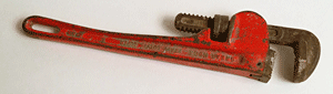
<li class="wrench"><img src="../assets/overlay/img/wrench.png"/></li>
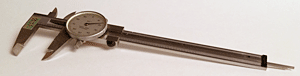
<li class="calipers"><img src="../assets/overlay/img/calipers.png"/></li>
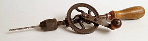
<li class="drill"><img src="../assets/overlay/img/drill.png"/></li>
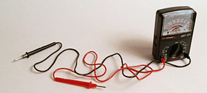
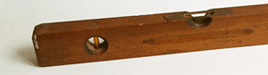
<li class="ohm"><img src="../assets/overlay/img/ohm.png"/></li>
<li class="level"><img src="../assets/overlay/img/level.png"/></li>
</ul>
Setting Up the YUI Instance
We'll use the Overlay module to provide shimming for correctly covering
<select> elements in IE. We'll use Event for its onmouseleave event, and
widget-anim as a plugin to provide the fade-in for the tooltip.
YUI().use('overlay', 'event', 'widget-anim', function (Y) {
    // code will go here.
});
Declare some variables
These variables include an array of strings for various tooltips.
If a DOM element has a class matching one of the name values in the tipText array,
it will display the corresponding text value in its tooltip when the cursor moves
over it.
var waitingToShow = false,

    // array for text to be displayed in tooltips
    tipText = [
        {'name': 'wrench', 'text': "Avoid dropping on toe."},
        {'name': 'calipers', 'text': 'Dial calipers: +- .001,<br>human hair .004'},
        {'name': 'drill', 'text': 'Variable-speed and cordless too.'},
        {'name': 'ohm', 'text': 'Never test microwaves with a volt-ohm meter.'},
        {'name': 'level', 'text': 'Unreliable in zero gravity conditions.'}
        // the array continues...
    ];
Instantiating The Tooltip
To create an overlay instance for the tooltip,
we use the overlay constructor Y.Overlay, specifying the source node
as the selector of the tooltip element.
var tooltip = new Y.Overlay({
    srcNode: "#tooltip",
    visible: false
}).plug(Y.Plugin.WidgetAnim);
tooltip.anim.get('animHide').set('duration', 0.01);
tooltip.anim.get('animShow').set('duration', 0.3);
tooltip.render();
Event Handlers
Create event handlers for the mouse events and place them above the listeners code.
// handler that positions and shows the tooltip
var onMousemove = function (e) {
    var i;
    if (tooltip.get('visible') === false) {
        // while it's still hidden, move the tooltip adjacent to the cursor
        Y.one('#tooltip').setStyle('opacity', '0');
        tooltip.move([(e.pageX + 10), (e.pageY + 20)]);
    }
    if (waitingToShow === false) {
        // wait half a second, then show tooltip
        setTimeout(function(){
            Y.one('#tooltip').setStyle('opacity', '1');
            tooltip.show();
        }, 500);

        // while waiting to show tooltip, don't let other
        // mousemoves try to show tooltip too.
        waitingToShow = true;

        // loop through the tipText array looking for a match between
        // the class name and the array literal `name`
        for (i = 0; i < tipText.length; i += 1) {
            if (e.currentTarget.hasClass(tipText[i].name)) {

                // found a match, so set the content in the tooltip's body
                tooltip.setStdModContent('body', tipText[i].text);
                break;
            }
        }
    }
}

// handler that hides the tooltip
var onMouseleave = function (e) {

    // this check prevents hiding the tooltip
    // when the cursor moves over the tooltip itself
    if ((e.relatedTarget) && (e.relatedTarget.hasClass('yui3-widget-bd') === false)) {
        tooltip.hide();
        waitingToShow = false;
    }
}
Event Listeners
Add listeners for mousemove and mouseout events
to whatever elements you want to have tooltips.
Using mousemove instead of mouseover, and using a delay in the transition
makes the tooltip fade in adjacent to the cursor.
See event delegation for efficient
event subscribing to multiple elements.
Y.delegate('mousemove', onMousemove, '.lists', 'li');
Y.delegate('mouseleave', onMouseleave, '.lists', 'li');
Y.one('#tooltip').on('mouseleave', onMouseleave);
This example demonstrates how you can use the existing Overlay component to create a one-off Tooltip for your page. If you plan to re-use the Tooltip on multiple pages, or in a variety of use cases, it's a good idea to encapsulate all the code which makes a tooltip work into a reusable Widget class. The example, Creating a Simple Tooltip Widget with Extensions, shows how you can create a reusable, flexible Tooltip class.
Complete Example Source
<style>
.example .lists {
margin: 10px auto; /*center in viewport*/
}
.example .list {
-moz-padding-start: 0;
-webkit-padding-start: 0;
width: 300px;
margin: 0;
}
.example #tooltip .yui3-widget-bd{
text-align: left;
max-width: 15em;
*width: 10em;
background-color: #FFF6D5;
border: solid 1px #aa8;
padding: 0.2em 0.5em 0.3em;
-moz-border-radius: 2px;
-webkit-border-radius: 2px;
-moz-box-shadow: 3px 3px 5px rgba(0,0,0,0.2);
-webkit-box-shadow: 3px 3px 5px rgba(0,0,0,0.2);
}
.example .list li{
list-style: none;
margin: 0 0 20px;
border: 1px solid #C9C9C9;
width: 300px;
}
.example .list img{
vertical-align: bottom;
}
.example .list .select{
padding: 1.5em 0 0.5em;
text-indent: 0.5em;
background-color: #F7DBB2;
}
</style>
<body class="yui3-skin-sam">
<div id="tooltip"></div>
<div class="yui3-g lists">
<div class="yui3-u-1-2"> <!-- see CSS Grids -->
<ul class="list">
<li class="wrench"><img src="../assets/overlay/img/wrench.png"></li>
<li class="calipers"><img src="../assets/overlay/img/calipers.png"/></li>
<li class="drill"><img src="../assets/overlay/img/drill.png"/></li>
<li class="ohm"><img src="../assets/overlay/img/ohm.png"/></li>
<li class="level"><img src="../assets/overlay/img/level.png"/></li>
</ul>
</div>
<div class="yui3-u">
<ul class="list">
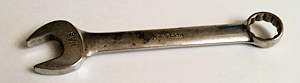
<li class="endwrench"><img src="../assets/overlay/img/endwrench.png"/></li>
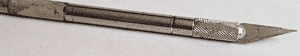
<li class="knife"><img src="../assets/overlay/img/knife.png"/></li>
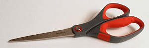
<li class="scissors"><img src="../assets/overlay/img/scissors.png"/></li>
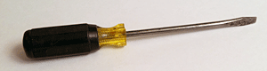
<li class="screwdriver"><img src="../assets/overlay/img/screwdriver.png"/></li>
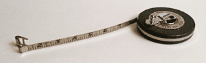
<li class="tape"><img src="../assets/overlay/img/tape.png"/></li>
<li class="select">Tooltips cover <select><option>select</option></select> elements in IE.</li>
</ul>
</div>
</div>
<script>
YUI().use('overlay', 'event', 'widget-anim', function (Y) {
var waitingToShow = false,
// array for text to be displayed in tooltips
tipText = [
{'name': 'wrench', 'text': "Avoid dropping on toe."},
{'name': 'calipers', 'text': 'Dial calipers: +- .001,<br>human hair .004'},
{'name': 'drill', 'text': 'Variable-speed and cordless too.'},
{'name': 'ohm', 'text': 'Never test microwaves with a volt-ohm meter.'},
{'name': 'level', 'text': 'Unreliable in zero gravity conditions.'},
{'name': 'endwrench', 'text': '11/16 box-end wrench A.K.A spanner - (British)'},
{'name': 'knife', 'text': 'Wants to roll off table and stick in foot.'},
{'name': 'scissors', 'text': "Don't run with these."},
{'name': 'screwdriver', 'text': 'Not intended for garden weeding.'},
{'name': 'tape', 'text': 'Remove before cutting.'},
{'name': 'select', 'text': 'Covering select'}
];
var tooltip = new Y.Overlay({
srcNode: "#tooltip",
visible: false
}).plug(Y.Plugin.WidgetAnim);
tooltip.anim.get('animHide').set('duration', 0.01);
tooltip.anim.get('animShow').set('duration', 0.3);
tooltip.render();
// handler that positions and shows the tooltip
var onMousemove = function (e) {
var i;
if (tooltip.get('visible') === false) {
// while it's still hidden, move the tooltip adjacent to the cursor
Y.one('#tooltip').setStyle('opacity', '0');
tooltip.move([(e.pageX + 10), (e.pageY + 20)]);
}
if (waitingToShow === false) {
// wait half a second, then show tooltip
setTimeout(function(){
Y.one('#tooltip').setStyle('opacity', '1');
tooltip.show();
}, 500);
// while waiting to show tooltip, don't let other
// mousemoves try to show tooltip too.
waitingToShow = true;
// loop through the tipText array looking for a match between
// the class name and the array literal `name`
for (i = 0; i < tipText.length; i += 1) {
if (e.currentTarget.hasClass(tipText[i].name)) {
// found a match, so set the content in the tooltip's body
tooltip.setStdModContent('body', tipText[i].text);
break;
}
}
}
}
// handler that hides the tooltip
var onMouseleave = function (e) {
// this check prevents hiding the tooltip
// when the cursor moves over the tooltip itself
if ((e.relatedTarget) && (e.relatedTarget.hasClass('yui3-widget-bd') === false)) {
tooltip.hide();
waitingToShow = false;
}
}
Y.delegate('mousemove', onMousemove, '.lists', 'li');
Y.delegate('mouseleave', onMouseleave, '.lists', 'li');
Y.one('#tooltip').on('mouseleave', onMouseleave);
});
</script>
</body>